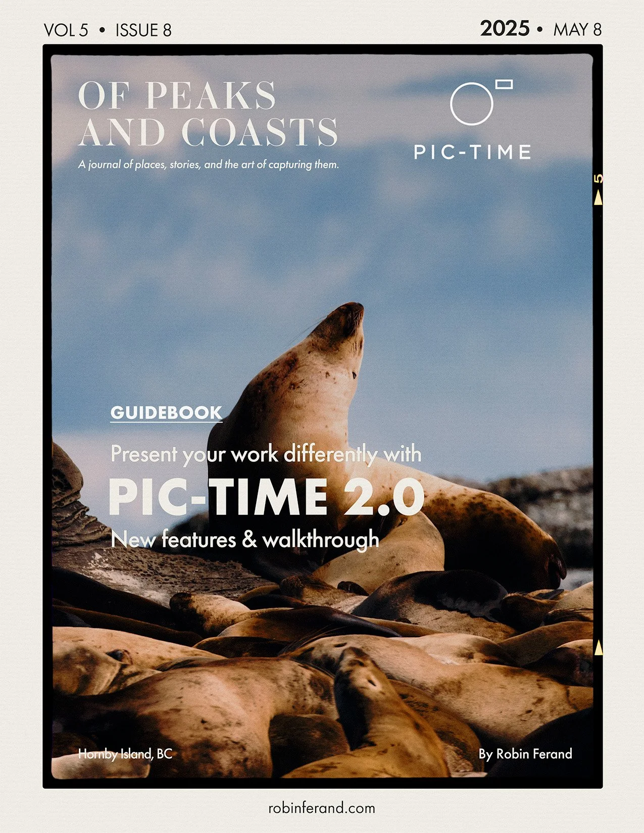
Pic-Time 2.0: Building a Client Gallery That Feels Like a Mini Website

A
practical Pic-Time 2.0 walkthrough focused on gallery design, cinematic gallery covers, mixed photo and video delivery, client presentation, print shop features, and how project-based photographers can create online galleries that feel more intentional and branded.
In this video, I walk through Pic-Time 2.0 and show how I would build a real client gallery using the new gallery design tools, gallery covers, fonts, colours, layouts, scene headers, video clips, and print shop features.
I have used Pixieset for online galleries for a long time, and I usually deliver mixed photo and video projects through a combination of galleries and file-sharing links. With Pic-Time 2.0, what caught my attention was the possibility of creating something that feels less like a folder of files and more like a small project website.
For the walkthrough, I use a Wildwaterways herring spawn tourism project as the example. It includes digital photographs, monochrome film, and video clips, which makes it a useful case study for anyone who delivers more than just still images.
Pic-Time is often built and marketed toward wedding and event photographers, but I wanted to look at it from the perspective of a photographer and filmmaker working with tourism, commercial, documentary, and project-based client work.
Disclaimer: This video is sponsored by Pic-Time.
Pic-Time 2.0 launch offer: New subscribers on any annual plan can get free migration of up to 200 galleries from another gallery platform until May 27.
DISCOVER EVERYTHING I USE TO PHOTOGRAPH WILDLIFE
Disclaimer: when you purchase an item through these links, I might earn a small commission which helps supporting my work and keeping this website ad-free.
Thank you!